APOLLUS APP
During Fall 2019, I worked on developing a fictional music app. ApollUs, which was named after the Greek god of music, Apollo, is an app much like Spotify, which provides users with access to music from creators from all over the world and with all different experience levels. What makes ApollUs different from its competitors is its focus on providing users with music that they can listen to and enjoy while they are working or studying. The music, as well as the color scheme are meant to be non-distracting yet supportive in the efforts to help students and professionals increase their productivity levels. Along with this, users also have the ability to upload their own music (which will be approved via a moderator) and donate to support their favorite creators.
Competitor Research
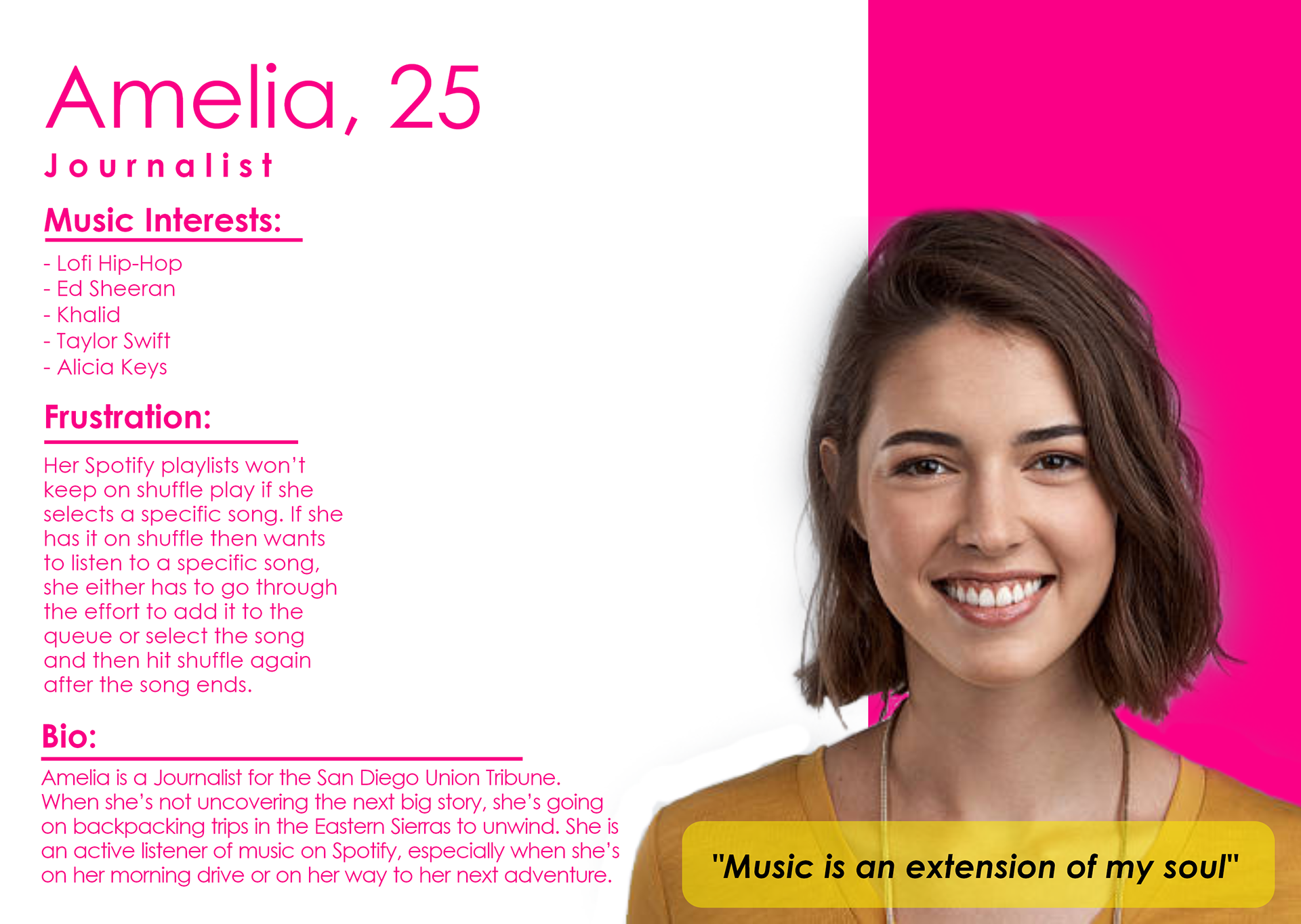
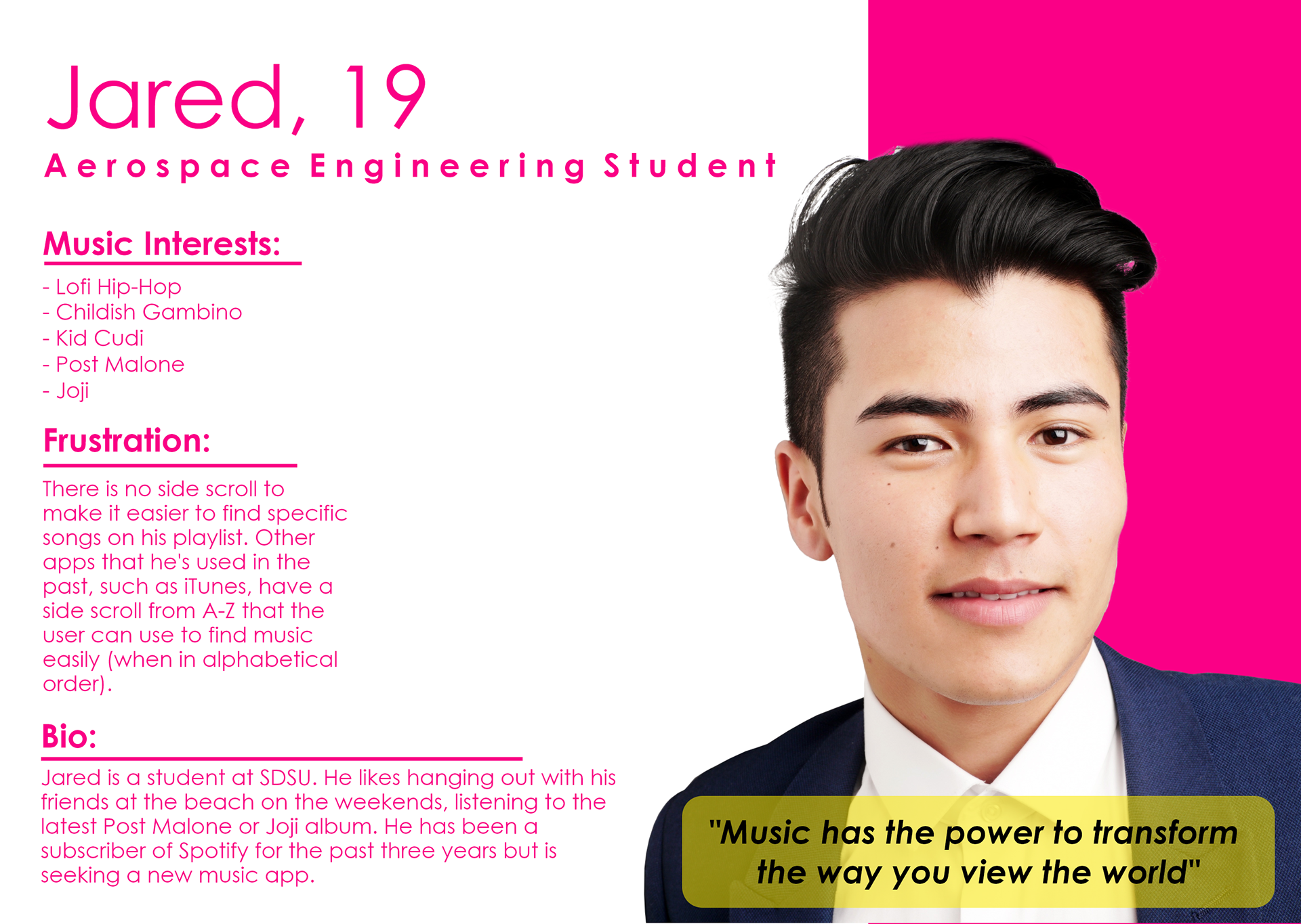
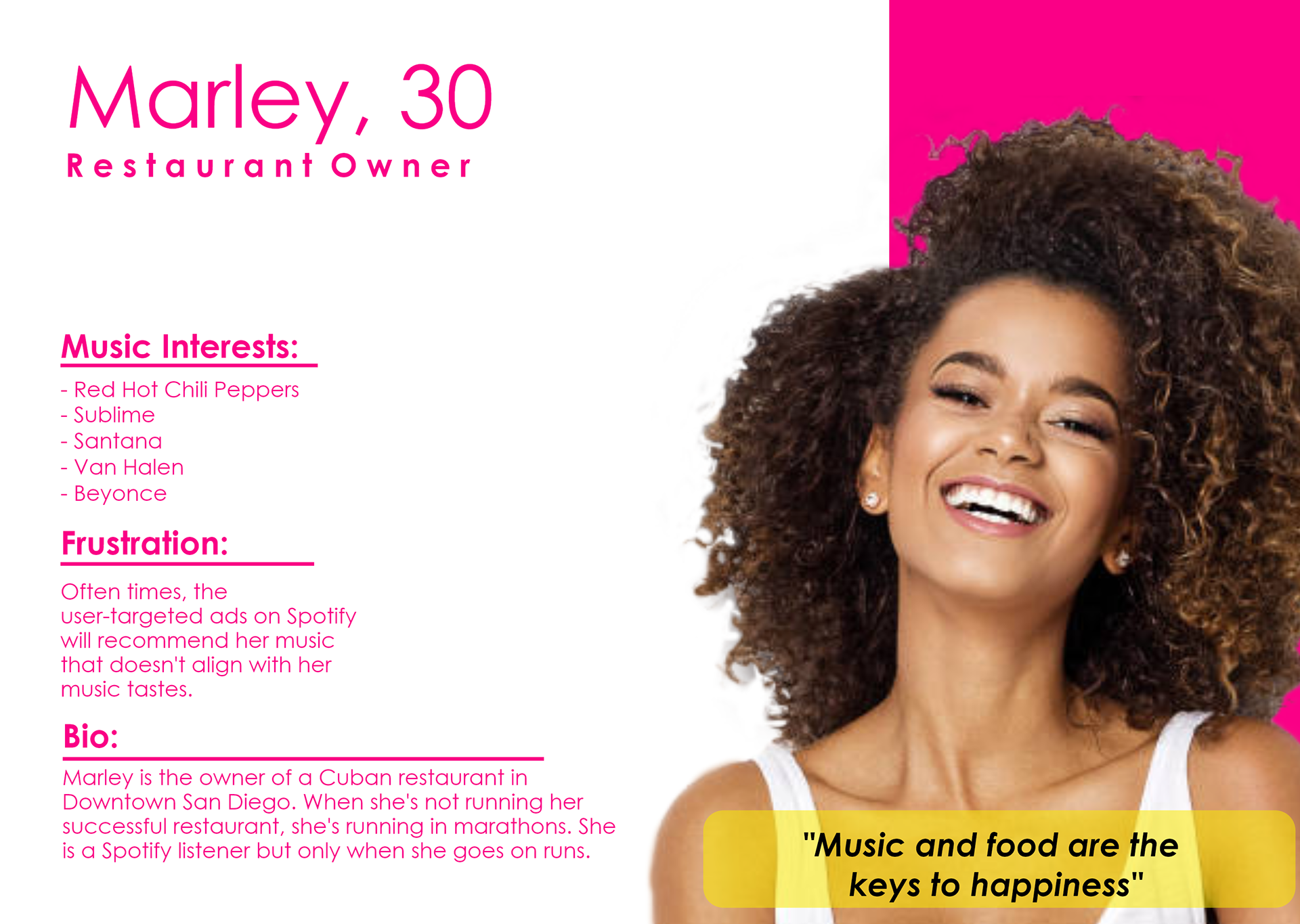
In the first phase of developing ApollUs, I began by figuring out who my main competitors would be and researched them. I chose to research Spotify, as well as iTunes, to get an idea of what the two do successfully and where they are lacking. Along with researching online, I also interviewed two Spotify users and an iTunes user. Based on my research, it seemed that the most appealing parts of both apps for users were the wide variety of music options as well as the ability to customize playlists. What users did not like about each app were that each app's algorithm would often suggest music that the users were not interested in rather than curating based off of listening preferences. One of the Spotify users also stated that they had a difficult time finding certain features, such as the settings and that mobile Spotify would not allow them to edit their profile.
Personas
User Journey Map
Low-Fidelity Wireframe
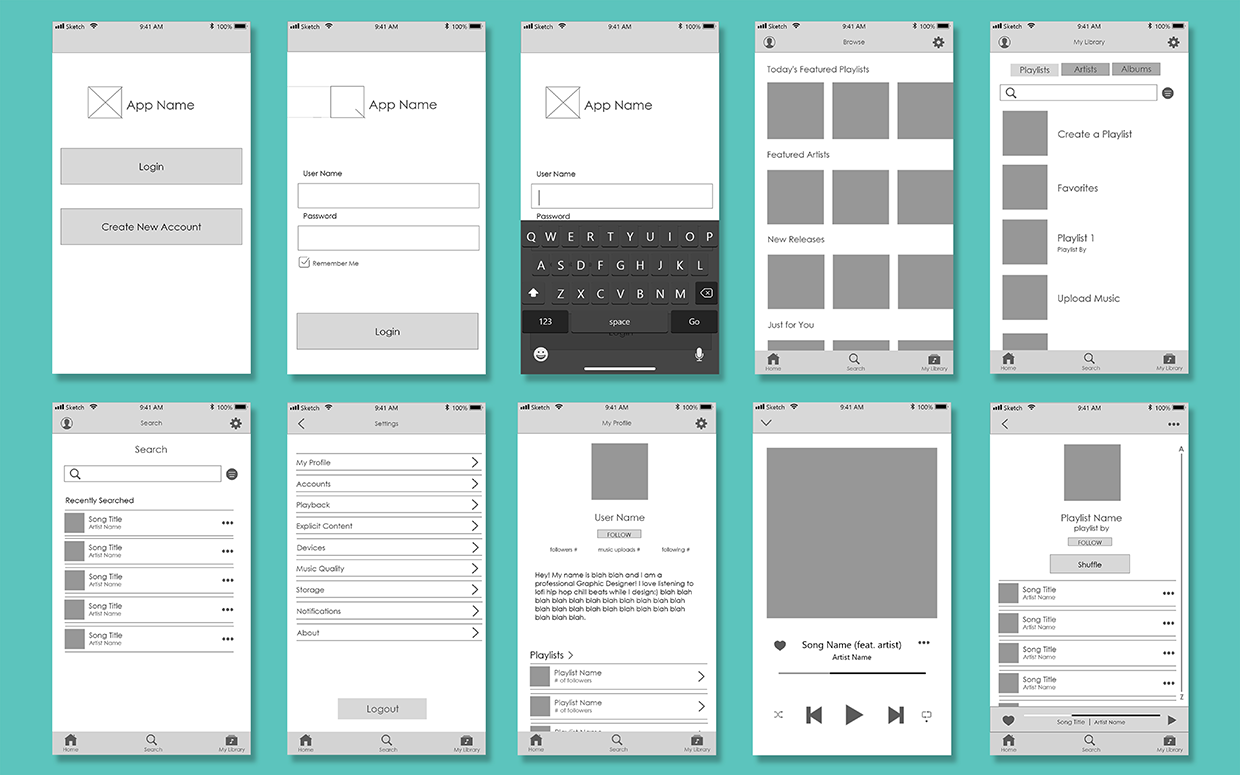
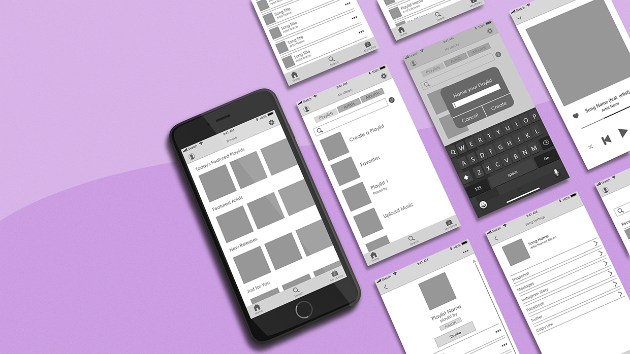
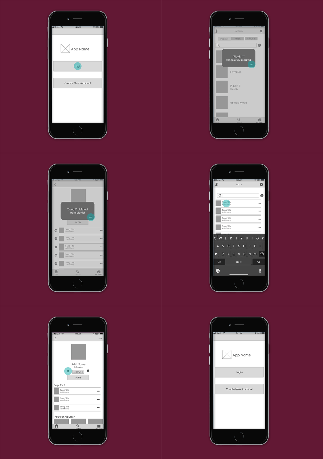
I then moved into Sketch to create a low-fidelity version of the app. Using only greyscale colors, simple shapes and text, I created a simple version of ApollUs, which I prototyped in Invision. I then returned to my initial 3 users and had them test the functionality of the app, as well as give me feedback on the screens as well as elements within them.
Low Fidelity Screens
Low Fidelity Screens
Login and Create a Playlist Flow
Again I approached my original interviewees to get feedback on my low fidelity app. Overall they felt as though the legibility and spacing were successful on the app. Each interviewee recommended a few small changes to fine tune the app. Carla suggested an "Add Songs" or "+" icon on the playlist screen so that users could easily add songs without having to go through the tedious process of going to settings then selecting "Add Songs." Jensen recommended changing the Filter Selection icon on the Library screen to one that users could more easily recognize. She also suggested adding an active state for the icons in the bottom navigation. Trenton suggested swapping the position of "Create a Playlist" and "Favorites" on the Library screen.
Moodboard
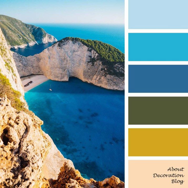
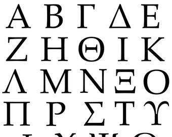
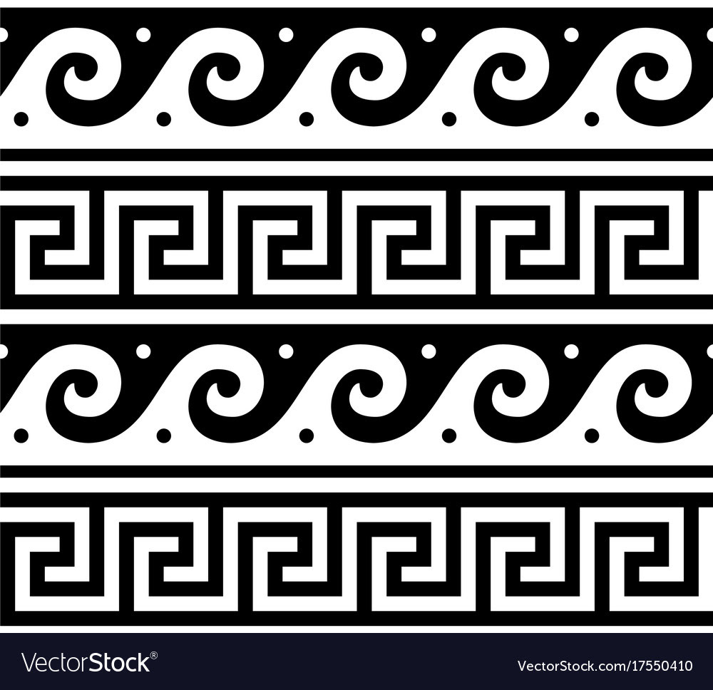
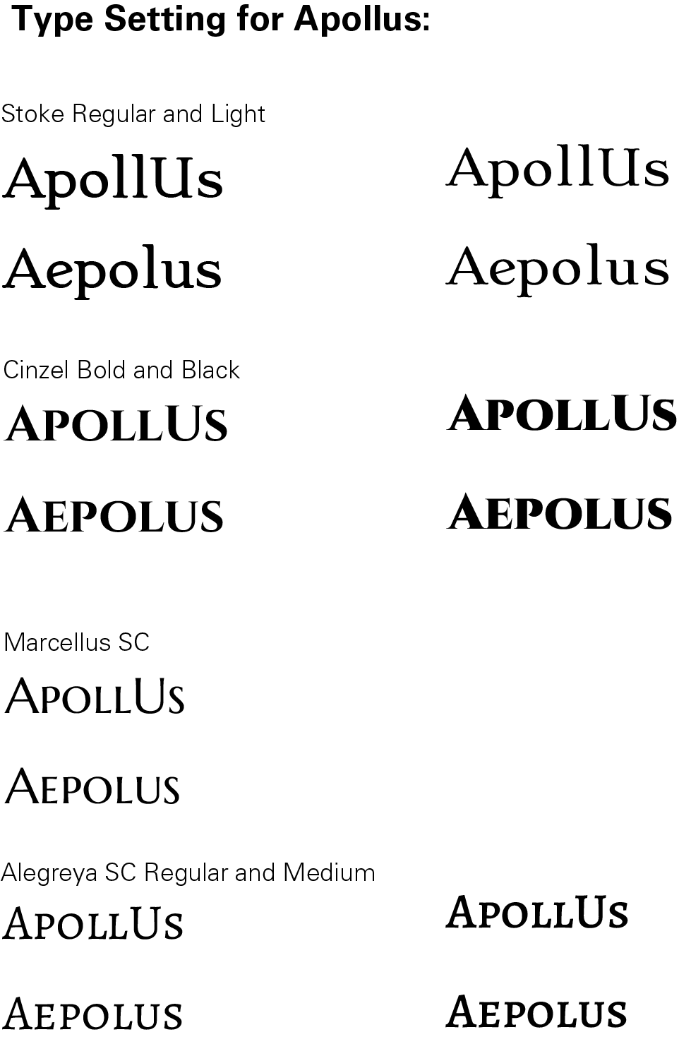
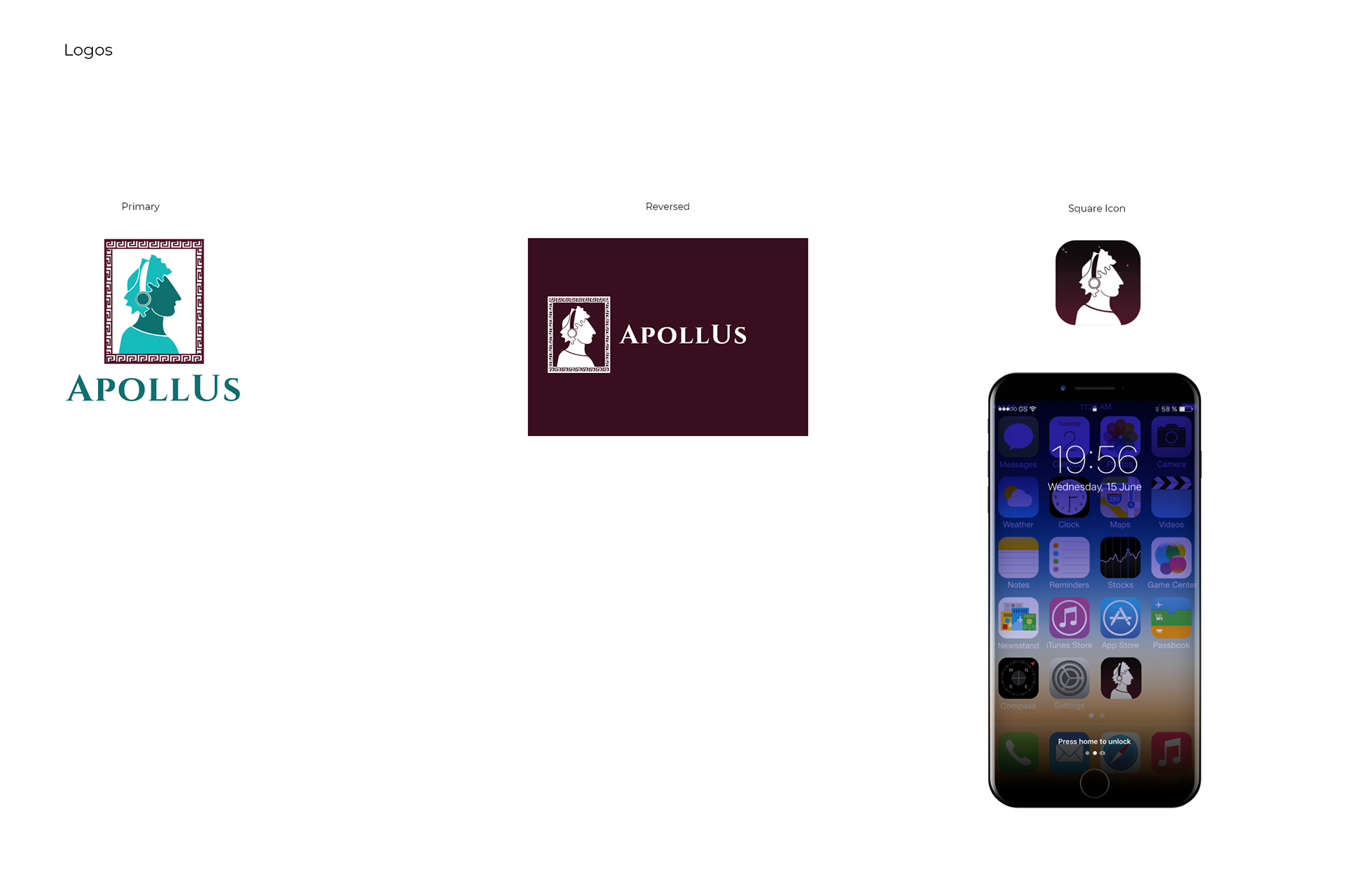
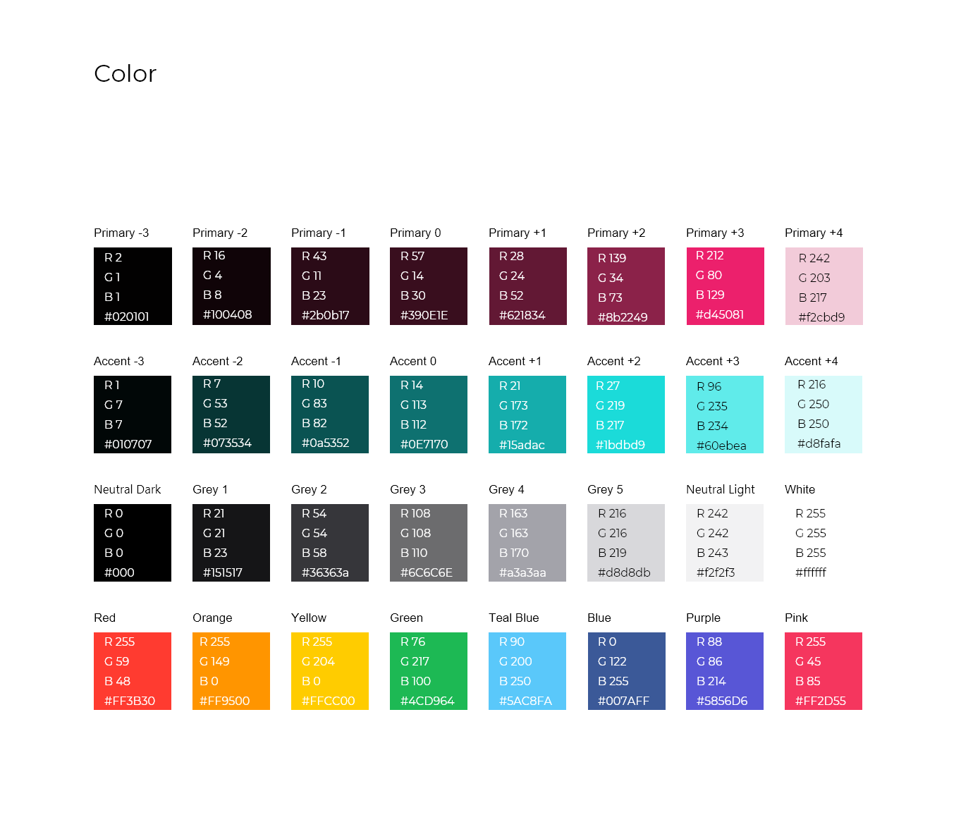
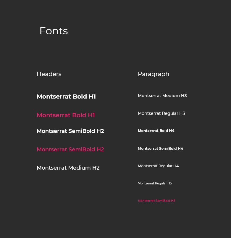
In the final stages of creating ApollUs, I began by doing some flash branding. In the span of an hour and a half, I came up with the name of the app, typefaces used, and color scheme. As I had stated previously, the name ApollUs was inspired by the Greek god of music, Apollo. The colors, teal blue and maroon also draw inspiration from Greece. The blue comes from the Greek flag, which consists of blue, gold, and white. Maroon, which is a variation of purple, is generally associated with royalty, which I felt was related to Apollo's status as a god. The typeface used for the logo, Cinzel Bold, is also reminiscent of ancient Greek writing. Lastly, I created the logomark, which consists of a profile vector drawing of Apollo wearing headphones.




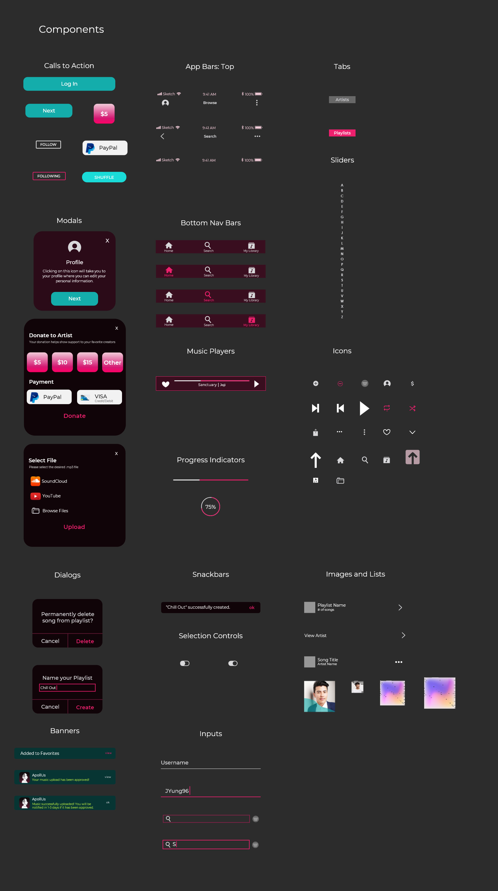
Design System
High-Fidelity Wireframe and Prototype
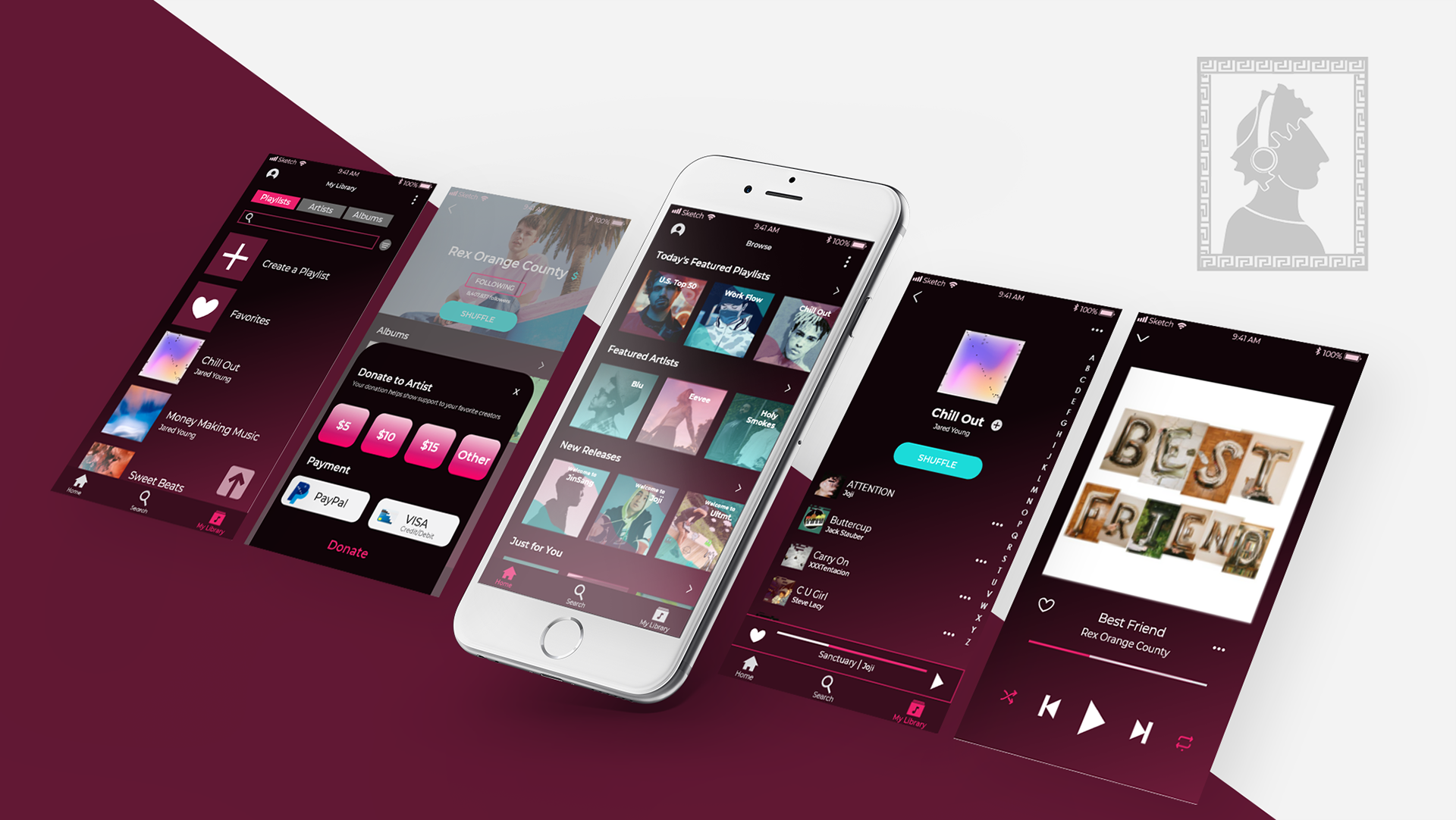
High Fidelity App Screens
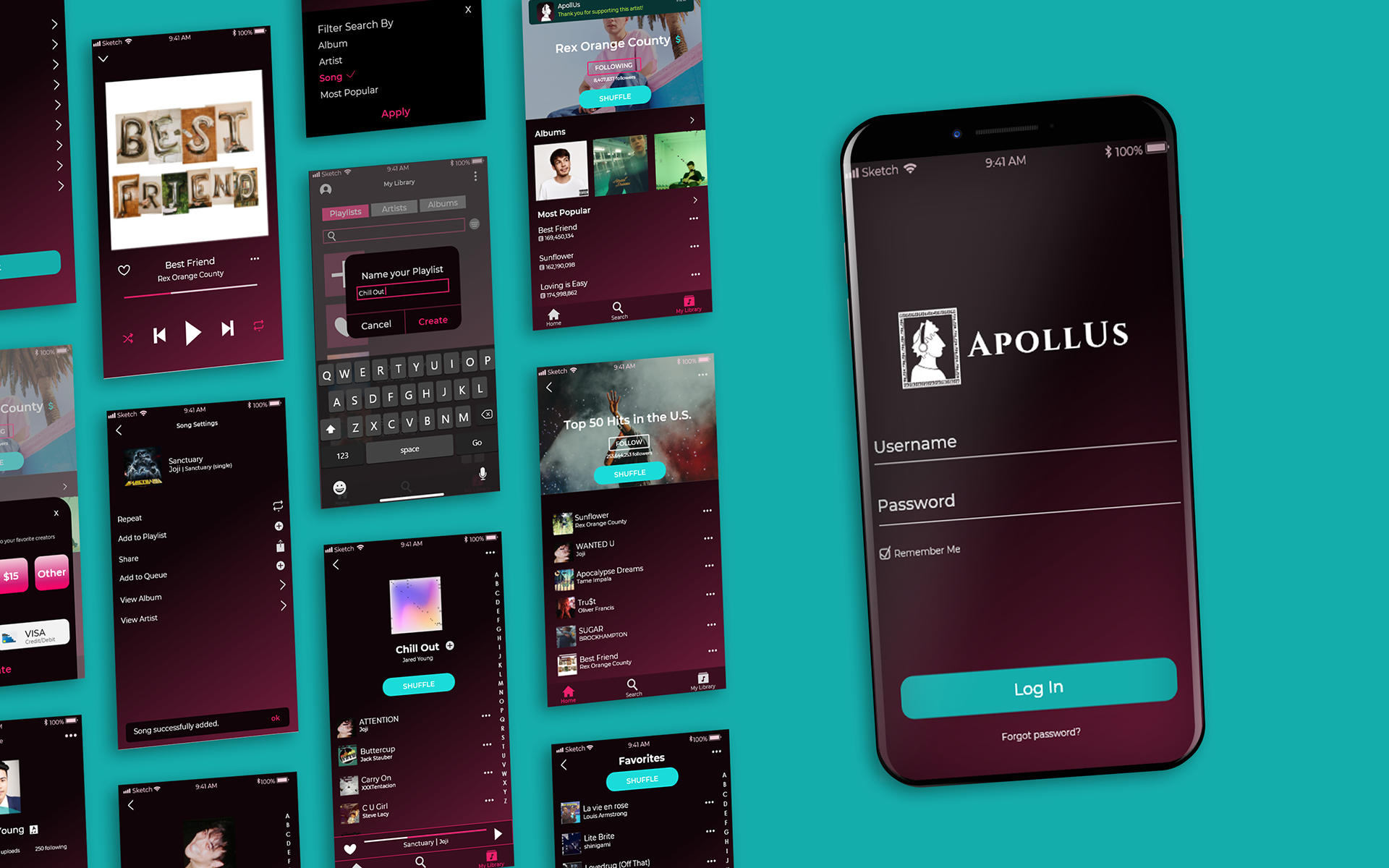
High Fidelity App Screens
User Testing Data Analysis
The demographic of the users that I interviewed ranged from college students to an older working professional. I chose this demographic because I intend for my app to be a helpful app, not only for students, but for professionals as well. The only real frustrations that the users all seemed to experience was that the screens were not scrollable, which they expected them to be since, ideally, they’d hold more content. Something that surprised me was that in two of the three interviews, users were expecting something to happen when they pushed the ‘shuffle’ button. Other than beginning a new song, I didn’t really think about whether or not touching the ‘shuffle’ button would prompt a visual action. Overall, I learned that the key to a great app is always user testing, especially with those who are non-designers. I think, sometimes even our design eye can blind us from the simplest and smallest of changes that need to be made in order to make the product more user-friendly.

